Data is the new gold. But without the right tools to visualize it, that gold remains buried. In today’s fast-paced business world, understanding your data is crucial.
Did you know that companies using data visualization tools are 28% more likely to find timely information than those who don’t?
As businesses generate more data than ever, the need for effective visualization tools has skyrocketed. Whether you’re a small business or a large enterprise, the right tool can transform raw data into actionable insights.
Let’s dive into the top tools that are making waves in 2024.
1. Tableau A Leading Tool for Business Data Visualization
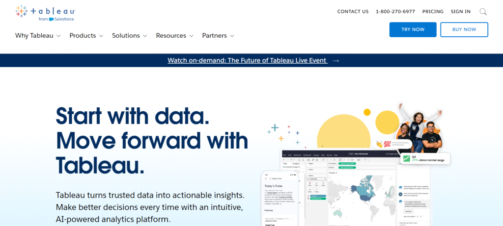
Reason to Buy Tableau:
- Advanced Visualization Capabilities: Tableau is renowned for its ability to create highly interactive and visually appealing dashboards, making it a top choice for data professionals looking to transform raw data into compelling insights.
- Ease of Use: The tool’s drag-and-drop interface allows users of varying technical expertise to create sophisticated visualizations without needing extensive coding knowledge.
- Extensive Data Source Connectivity: Tableau can connect to a wide range of data sources, from spreadsheets and cloud databases to on-premise solutions, making it highly versatile for different business environments.
- Real-Time Data Analysis: The ability to analyze and visualize data in real-time helps businesses make timely and informed decisions.
- Robust Community Support: Tableau’s large and active user community provides a wealth of resources, tutorials, and forums that enhance the user experience and facilitate learning.
What Sets Tableau Apart:
- Dynamic Dashboards: Tableau’s dashboards are highly interactive, allowing for drill-down capabilities, data filtering, and real-time updates. This makes it easier to identify trends and anomalies within large datasets.
- Data Storytelling: Tableau’s unique data storytelling feature allows users to create narratives around their data, helping to convey insights in a way that resonates with stakeholders. This is particularly useful for presentations and reporting.
- Cross-Platform Compatibility: Tableau supports deployment on both cloud and on-premise environments, and its visualizations can be accessed across multiple devices, including tablets and smartphones, ensuring flexibility and accessibility.
- Customization and Scalability: Tableau offers extensive customization options, allowing businesses to tailor the tool to their specific needs. It’s also scalable, making it suitable for organizations of all sizes.
What It Lacks:
- High Cost: One of the main drawbacks of Tableau is its pricing. Compared to other data visualization tools, Tableau is relatively expensive, which might be a barrier for small to medium-sized businesses.
- Learning Curve: While Tableau is user-friendly for basic tasks, mastering its advanced features and functionalities can require significant time and effort, especially for users new to data visualization.
- Limited Predictive Analytics: Tableau’s predictive analytics capabilities are not as advanced as some of its competitors, which might be a limitation for businesses looking for comprehensive data science tools.
- Performance Issues with Large Datasets: Some users have reported performance slowdowns when working with extremely large datasets or complex visualizations, especially in environments with limited resources.
2. Microsoft Power BI for Business Data Visualization
Why You Should Consider Microsoft Power BI:
- Seamless Integration with Microsoft Ecosystem: Power BI integrates effortlessly with other Microsoft products like Excel, Azure, and Teams, making it a natural choice for businesses already invested in the Microsoft environment.
- Scalability and Flexibility: Power BI scales from individual use with its free Desktop version to enterprise-level deployment with Premium offerings, accommodating businesses of all sizes.
- Affordable Entry Point: With a free version available and affordable Pro subscriptions, Power BI offers a cost-effective solution for small to medium-sized businesses needing powerful data visualization without breaking the bank.
- Comprehensive Data Modeling: Power BI excels in providing robust data modeling and analytical capabilities, including AI-driven insights and predictive analytics, making it a versatile tool for complex data environments.
- Frequent Updates and Improvements: Microsoft regularly updates Power BI, ensuring that users have access to the latest features and security improvements.
What Sets Power BI Apart:
- Interactive Dashboards and Reports: Power BI enables the creation of highly interactive dashboards with features like drill-down, custom visuals, and real-time data monitoring, which are crucial for dynamic business environments.
- Powerful Data Connectivity: It supports a vast array of data sources, including SQL databases, cloud services, and web data, making it incredibly versatile in how it can ingest and process data.
- Unified Data Environment: The tool consolidates data from various sources into a single, reliable “source of truth” via its OneLake integration, simplifying data management and reducing redundancies.
- Accessibility Across Devices: With responsive design and dedicated mobile apps, Power BI ensures that reports and dashboards are accessible on any device, enhancing productivity and decision-making on the go.
Areas Where Power BI Falls Short:
- Complexity for Beginners: Despite its user-friendly interface, the vast number of features and customization options can be overwhelming for new users, leading to a steep learning curve.
- Limited Features in Free Version: The free Desktop version of Power BI lacks some critical features like report sharing and collaboration, which are only available in the paid Pro and Premium versions.
- High Costs for Larger Deployments: While the initial entry cost is low, enterprise-level deployments (especially those requiring Premium features) can become expensive, potentially straining budgets for larger organizations.
- Performance Issues with Large Datasets: Some users have reported performance slowdowns when handling extremely large datasets or performing complex calculations, which could hinder efficiency in data-heavy environments.
3. Qlik Sense A Top Tool for Business Data Visualization
Reasons to Choose Qlik Sense:
- Associative Engine for Data Exploration: Qlik Sense’s unique associative engine allows users to explore data relationships dynamically, revealing hidden insights that might be missed with traditional linear query-based tools.
- Highly Interactive Visualizations: The platform excels in creating interactive, guided analytics. It allows users to easily build and interact with visualizations, making complex data more accessible.
- Flexible Licensing and Deployment: Qlik Sense offers various licensing options, including both free and subscription-based plans that can scale according to business needs. It also supports both on-premises and cloud deployments, providing flexibility in how and where the tool can be used.
- AI-Enhanced Analytics: The inclusion of AI-driven features, such as the Insight Advisor, helps automate data analysis and generate insights, which is particularly useful for non-technical users.
- Responsive Design for Mobile Use: Qlik Sense is optimized for touch devices and provides a seamless experience across desktops, tablets, and smartphones, ensuring that users can access and interact with their data on the go.
What Sets Qlik Sense Apart:
- Associative Experience: Unlike many other tools that rely on predefined hierarchies, Qlik Sense’s associative model enables users to explore data freely. This allows for a more intuitive exploration of data and uncovering of patterns that might otherwise go unnoticed.
- Wide Data Connectivity: Qlik Sense is known for its robust ability to connect to a wide array of data sources, making it a versatile tool for organizations with diverse data ecosystems. It ranks highly for intelligent data linking and can handle complex data relationships effectively.
- Customizable Dashboards and Reports: The platform offers extensive customization options for dashboards and reports, allowing users to tailor their visualizations to specific needs and preferences. This flexibility is a significant advantage for businesses that require a high degree of control over their data presentations.
Areas Where Qlik Sense Could Improve:
- Steeper Learning Curve: While Qlik Sense offers powerful features, it requires users to rethink traditional data modeling approaches. This can lead to a steeper learning curve, particularly for those accustomed to more conventional BI tools.
- Smaller Ecosystem: Compared to some of its competitors, Qlik Sense has a more limited ecosystem of add-ons and third-party integrations. This might be a drawback for businesses looking for a wide range of out-of-the-box functionalities.
- Performance with Massive Datasets: Some users have noted performance issues when working with extremely large datasets, particularly in environments with limited resources. While Qlik Sense is designed to handle big data, optimizing performance might require additional fine-tuning.
- Pricing Considerations: Although Qlik Sense offers flexible licensing, its pricing can be relatively high, especially for smaller businesses. The cost may become a factor when considering the full scope of its features against more affordable alternatives.
4. Google Looker Studio A Top Data Visualization Tool
Why You Should Consider Google Looker Studio:
- Seamless Integration with Google Services: Looker Studio, formerly known as Google Data Studio, integrates smoothly with other Google products such as Google Analytics, Google Sheets, and Google Ads. This makes it an excellent choice for businesses already using the Google ecosystem.
- Free to Use: One of the most appealing aspects of Looker Studio is that it is entirely free, offering robust data visualization and reporting features without any financial investment.
- User-Friendly Interface: Looker Studio’s drag-and-drop interface is designed to be intuitive, even for users with limited technical expertise. This makes it accessible to a broad range of users, from marketing teams to business analysts.
- Customizable Dashboards and Reports: The tool allows users to create highly customizable dashboards with various widgets, charts, and visual elements that can be tailored to specific business needs.
- Scalability: Looker Studio can handle small to medium-sized datasets efficiently and can scale up using Google Cloud services like BigQuery for larger data processing needs.
What Sets Looker Studio Apart:
- Integration with Google BigQuery: For businesses dealing with large datasets, Looker Studio’s integration with Google BigQuery offers powerful data processing and real-time dashboard sharing capabilities, enhancing its scalability and performance.
- Collaborative Features: Looker Studio supports real-time collaboration, allowing multiple users to work on the same report simultaneously, which is particularly useful for teams spread across different locations.
- Data Blending Capabilities: The platform allows users to blend data from multiple sources, providing a comprehensive view of business performance across different channels. This is especially beneficial for businesses looking to combine data from various platforms like Meta, Google Ads, and more.
- Template and Report Sharing: Looker Studio makes it easy to create templates and share reports with team members or clients. However, it should be noted that free users have limited sharing options, with advanced sharing features available in the paid enterprise version.
Areas Where Looker Studio Falls Short:
- Performance with Large Datasets: While Looker Studio performs well with small to medium-sized datasets, users might experience slower performance when handling larger, more complex datasets. This can lead to longer rendering times, especially when multiple users are working on the same report.
- Limited Customization and Export Options: Unlike some of its competitors, Looker Studio has fewer customization options for its visualizations and does not offer as many export formats, which might be a limitation for users needing more flexibility in their reporting.
- Steeper Learning Curve for Advanced Features: While the basic functionalities are user-friendly, mastering more advanced features in Looker Studio can be challenging, especially for users without a background in data analytics. The lack of comprehensive onboarding support can make this even more difficult.
- Limited Offline Access: Since Looker Studio is a cloud-based tool, users need a consistent internet connection to access and interact with their dashboards, which might not be ideal for those who require offline access to their reports.
5. Sisense An Advanced Tool for Business Data Visualization
Why You Should Consider Sisense:
- Exceptional Data Integration Capabilities: Sisense stands out for its robust ability to integrate data from multiple sources, making it a powerful tool for consolidating and visualizing complex datasets across your business.
- In-Chip Technology for Speed: The tool’s unique in-chip technology ensures fast processing and visualization, even with massive datasets, allowing businesses to analyze millions of data points in seconds.
- Customizable Dashboards: Sisense offers a high level of customization, allowing users to tailor dashboards to their specific needs, ensuring that the data is presented in the most useful and accessible way possible.
- Strong Customer Support: Users consistently praise Sisense for its responsive and helpful customer support, which assists in everything from implementation to handling advanced queries.
- Cost-Effectiveness for Larger Organizations: While Sisense can be pricey, it offers significant value for large enterprises that require extensive data processing and visualization capabilities.
What Sets Sisense Apart:
- Powerful Embedded Analytics: Sisense excels in embedding analytics into existing applications, allowing businesses to integrate data insights directly into their workflows. This feature is particularly valuable for companies looking to streamline their data-driven decision-making processes.
- Advanced Visualization Tools: With a wide range of visual elements like widgets, graphs, and interactive maps, Sisense empowers users to create visually compelling reports and dashboards that are both informative and engaging.
- Elasticube Technology: Sisense’s Elasticube technology allows for offline data storage and processing, making it highly versatile for businesses that need to work with data both on-premises and in the cloud.
Areas Where Sisense Falls Short:
- Steep Learning Curve: Sisense’s powerful features often come with a steep learning curve, particularly for non-technical users. Mastery of the platform may require significant IT support and familiarity with programming languages such as JavaScript and SQL.
- High Cost for Small Businesses: While Sisense is cost-effective for large enterprises, smaller businesses may find the pricing structure prohibitive, especially when only a few licenses are needed.
- Performance Issues with Large Data Volumes: Some users have reported that the platform can lag when handling exceptionally large datasets, which can be a drawback for companies that require real-time data processing.
- Complexity in Dashboard Customization: Customizing dashboards and visualizations in Sisense may require knowledge of CSS and JavaScript, making it less accessible for teams without dedicated development resources.
6. Zoho Analytics Comprehensive Review
Why You Should Consider Zoho Analytics:
- Ease of Use and Accessibility: Zoho Analytics is celebrated for its user-friendly interface, making it accessible even for non-technical users. Its drag-and-drop capabilities allow users to create reports and dashboards without needing to write code.
- Extensive Data Integration: The tool supports a wide range of data sources, allowing users to pull data from cloud storage, databases, and various business applications. This flexibility enables a holistic view of business operations.
- Cost-Effective: Zoho Analytics offers a compelling price-to-performance ratio, making it an attractive choice for small to medium-sized businesses that need robust data analytics without breaking the bank.
- AI-Powered Analytics: The inclusion of Zia, Zoho’s AI-powered assistant, allows users to perform natural language queries and receive automated insights, adding a layer of intelligence to data analysis.
- Collaboration and Sharing: The platform facilitates collaboration by allowing users to share reports and dashboards easily. Features like report scheduling and embedding further enhance its utility in a business environment.
What Sets Zoho Analytics Apart:
- Unified Data Analytics Platform: Zoho Analytics is more than just a visualization tool; it’s a comprehensive platform that includes data integration, preparation, visualization, and predictive analytics. This makes it a versatile solution for businesses of all sizes.
- Scalability and Flexibility: The tool’s architecture is designed to scale with your business. Whether you’re a small business or a large enterprise dealing with massive datasets, Zoho Analytics can handle your needs thanks to its scalable columnar database technology.
- Extensive Customization Options: Zoho Analytics allows users to create highly customizable dashboards and reports, with features like white labeling and the ability to embed reports in other applications. This level of customization helps businesses tailor the tool to their specific needs.
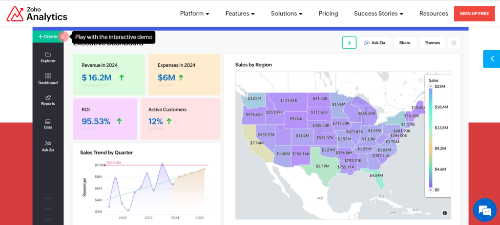
- Geospatial Analytics: The platform offers strong geospatial analysis capabilities, allowing businesses to visualize data geographically, which is particularly useful for regional performance comparisons and location-based insights.
Areas Where Zoho Analytics Falls Short:
- Steep Learning Curve for Non-Technical Users: While the tool is user-friendly, some users report that its extensive features and options can be overwhelming, especially for those without a technical background.
- User Interface Complexity: The abundance of features and customization options, while powerful, can lead to a cluttered user interface that might be confusing for first-time users.
- Limited Query Capabilities: Although Zoho Analytics provides robust visualization and reporting tools, its query capabilities can be limited compared to more advanced BI tools, which might be a drawback for users needing complex data manipulations.
7. Domo A Robust Tool for Business
Why You Should Consider Domo:
- Comprehensive Data Integration: Domo excels at consolidating data from a wide variety of sources, including both on-premises and cloud-based systems. Its extensive connectors make it easy to centralize all business data into a single, unified view.
- Real-Time Insights: The platform provides real-time access to data, allowing users to make timely decisions based on the latest information. This is especially useful for businesses that need to stay on top of trends and react quickly.
- User-Friendly Interface: Domo’s intuitive interface is designed for both technical and non-technical users, making it accessible to everyone in the organization. This ease of use is complemented by customizable dashboards that cater to the specific needs of different roles.
- Advanced Collaboration Features: Domo stands out with its unique social features that promote real-time collaboration and communication within the platform. Tools like Domo Buzz enable teams to discuss data insights directly within the application, reducing the need for separate meetings or communication tools.
- Mobile Accessibility: With native apps for iOS and Android, Domo ensures that users can access and interact with their data from anywhere, at any time. This mobile-first approach is ideal for businesses that require flexibility and remote access.
What Sets Domo Apart:
- Integrated Collaboration Tools: Unlike many other BI tools, Domo includes social collaboration features that allow users to share insights and discuss data within the platform. This makes it easier for teams to work together and make data-driven decisions.
- Customizable Dashboards and Alerts: Domo allows users to create highly customized dashboards that can be tailored to specific business needs. Users can also set up alerts to notify them of important changes in key metrics, ensuring they stay informed without constantly monitoring the data.
- Flexible and Scalable: Domo is highly scalable, making it suitable for businesses of all sizes, from small enterprises to large corporations. The platform’s flexibility in connecting with various data sources and its ability to handle large datasets are significant advantages.
Areas Where Domo Falls Short:
- High Cost: One of the most commonly cited drawbacks of Domo is its cost. The pricing can be prohibitive, especially for smaller businesses, and many advanced features require additional add-ons, which further increase the overall expense.
- Performance Issues: Users have reported that Domo can experience slowdowns, particularly when handling very large datasets. This can be a significant issue for businesses that rely on quick data processing and analysis.
- Limited Customer Support: While Domo offers various support channels, user feedback suggests that the quality of customer support can be inconsistent. Some users have experienced long response times and difficulties in resolving issues.
- Lacks Some Advanced BI Features: Despite its robust offerings, Domo lacks certain advanced business intelligence features that are available in other leading BI tools. For example, it may not support complex data manipulation tasks as effectively as some competitors.
8. Highcharts A Premier Data Visualization Tool

Why Choose Highcharts:
- Extensive Customization Options: Highcharts offers a wide range of chart types and customization capabilities, allowing businesses to tailor their data visualizations to meet specific needs. Whether it’s simple bar charts or complex heatmaps, Highcharts delivers flexibility in design.
- Cross-Platform Compatibility: This tool works seamlessly across multiple platforms, including web, Android, iOS, and major programming frameworks like Angular, Vue, and React. This makes it versatile for developers working in diverse environments.
- Strong Performance with Large Datasets: Highcharts excels at rendering large datasets quickly, thanks to its WebGL-powered boost module. This is particularly valuable for businesses dealing with high-volume data that need to be visualized efficiently.
- Extensive API Support: Highcharts provides robust API support, which makes it easier for developers to integrate and extend its functionalities within existing systems.
- Accessibility Features: With built-in accessibility modules, Highcharts ensures that visualizations are accessible to a broader audience, including those with disabilities. This includes support for screen readers and sonification APIs that convert data into sound.
What Sets Highcharts Apart:
- Developer-Focused: Highcharts is particularly favored by developers for its pure JavaScript foundation, which enables deep customization and control over every aspect of the charting process. The tool’s extensive documentation and strong community support further enhance its appeal to technical users.
- Wide Range of Supported Languages: The tool’s compatibility with multiple programming languages (e.g., .Net, PHP, Python, R) and frameworks makes it highly adaptable. This broad support is a significant advantage for development teams looking for a versatile visualization solution.
- Intelligent Responsiveness: Beyond just fitting to screen size, Highcharts intelligently adjusts non-graph elements like labels and legends for optimal display, ensuring that visualizations look great on any device, including touchscreens.
- Interactive and Real-Time Visualizations: Highcharts supports interactive features like zooming, tooltips, and multi-touch gestures, which enhance user engagement. Its ability to update live data feeds in real-time is particularly beneficial for applications that require dynamic data visualizations.
Where Highcharts Falls Short:
- Steep Learning Curve for Non-Developers: While Highcharts offers extensive customization options, it can be challenging for non-technical users. The tool is primarily designed for developers with JavaScript knowledge, making it less accessible to those without a coding background.
- Complex Customization: Despite its flexibility, some users find that navigating and implementing specific customizations can be complex and time-consuming. This may require additional effort in terms of searching through documentation and experimenting with settings.
- Limited Built-In Predictive Analytics: Unlike some other visualization tools, Highcharts does not focus heavily on advanced analytics or predictive modeling features. This could be a limitation for users looking for more comprehensive data science capabilities.
9. FusionCharts A Leading Business Data Visualization Tool

Why You Should Consider FusionCharts:
- Extensive Chart Variety: FusionCharts offers over 150 chart types and 2000 map types, providing a vast array of options to represent data in the most effective way for your business needs. This makes it ideal for diverse industries and applications.
- Cross-Platform Compatibility: This tool integrates seamlessly with various programming languages and platforms, ensuring ease of implementation across different development environments, whether web or mobile.
- Real-Time Data Handling: FusionCharts excels at rendering large datasets quickly, making it perfect for displaying real-time data without compromising performance.
- User-Friendly with Robust Documentation: Despite its rich features, FusionCharts is designed to be user-friendly. Comprehensive documentation, along with numerous examples and demos, facilitates a smooth onboarding process for developers.
- Flexible and Transparent Licensing: FusionCharts offers flexible pricing plans and does not charge for per-production or per-testing servers, making it a cost-effective choice for businesses with varying needs.
What Sets FusionCharts Apart:
- Customization and Flexibility: FusionCharts allows extensive customization, enabling businesses to tailor the appearance and behavior of their visualizations to match their branding or application design. This includes options for theme creation, interactive dashboards, and animated charts.
- Interactive and Animated Visualizations: FusionCharts stands out with its ability to create visually appealing, interactive, and animated charts that enhance user engagement and make data storytelling more effective.
- Versatile Export Options: The tool supports exporting charts and dashboards in various formats, including JPG, PNG, SVG, and PDF, which is particularly useful for sharing insights across teams and platforms.
- Comprehensive Support and Training: FusionCharts provides various support channels, including 24/7 live support, extensive training resources, and a knowledge base, ensuring users have access to help when needed.
Areas Where FusionCharts Could Improve:
- Learning Curve for New Users: While FusionCharts is powerful, new users, especially those unfamiliar with data visualization, might face a steep learning curve due to the tool’s extensive customization options.
- Limited Modern Themes: Some users have noted that the existing themes could benefit from a more modern touch, requiring additional custom styling to achieve the desired look and feel.
- Performance and Responsiveness: Although FusionCharts handles large datasets well, some users have reported occasional issues with responsiveness and bugs, particularly when implementing complex visualizations.
- Sales and Support Experience: A few users have mentioned dissatisfaction with the sales process, citing aggressive upselling and slow response times from customer support as areas needing improvement.
10. Datawrapper A Leading Tool for Simplified Data Visualization
Why Consider Datawrapper:
- Ease of Use: Datawrapper is incredibly user-friendly, making it accessible even for those with limited technical expertise. Its intuitive interface allows users to create professional-quality charts, maps, and tables without needing to write code.
- Diverse Visualization Options: The tool supports a wide range of visualization types, including bar charts, line charts, scatter plots, and even geographic maps, providing flexibility for various data presentation needs.
- Real-Time Updates: Datawrapper excels in providing real-time mobile optimization and ensures that your visualizations are always up-to-date, which is crucial for dynamic presentations or dashboards.
- Free Plan Availability: For those on a budget, Datawrapper offers a free plan with essential features, making it an excellent choice for small businesses or individual users looking to create simple, effective visualizations.
What Makes Datawrapper Stand Out:
- Journalist-Friendly Design: Originally developed with journalists in mind, Datawrapper is tailored for quick and effective data storytelling. It’s particularly well-suited for media professionals who need to present data in a clear, accessible manner.
- No Coding Required: One of the standout features of Datawrapper is that it does not require any coding skills, allowing users to jump right into creating visualizations. This lowers the barrier to entry significantly compared to more complex tools like Tableau or Power BI.
- Seamless Integration with Data Sources: Datawrapper easily integrates with various data sources, such as PDFs, CSVs, and web platforms, enabling quick data imports and visualization with minimal hassle.
Areas Where Datawrapper Falls Short:
- Limited Advanced Features: While perfect for basic to intermediate data visualization tasks, Datawrapper might not satisfy users looking for advanced analytics or complex data manipulation features. Tools like Tableau or Power BI offer more robust capabilities in these areas.
- Targeted User Base: Datawrapper’s primary design focus on journalists and media professionals means that it may not be the best fit for all business environments, particularly those requiring extensive customization or complex data integration.
- Pricing for Advanced Plans: Although the free plan is quite generous, advanced features and customization options come at a higher cost, which might be a consideration for budget-conscious users.

